Introduction
Data can only reach its full potential when communicated well to the audience. In a crisis situation, people are thirsty for information, and clear data communication becomes especially crucial. Communicating data as tables might be the easiest for data providers, but the trends and effects associated with infectious diseases are best shown using data visualisations.
General considerations for visualising data
Data can be illustrated in various ways, each way conveying a different message about the data. During the COVID-19 pandemic, teams across the world started to create visualisations and dashboards to understand the situation. We have captured here examples of different plots and data types that might be useful when communicating infectious disease data to a wide audience.
Considerations
- Data visualisations should be accessible for all users. To be accessible, they must be perceivable, operable, understandable, and robust. For example, you should:
- Consider that some colours may be indistinguishable to users with colour blindness;
- The contrast between two colours must be enough to enable people to distinguish them. For example, black text can be seen clearly on a white background because there is sufficient contrast between black and white;
- Interactive features must be built such that users with motility issues can use them with ease (e.g. by using the keyboard rather than a mouse);
- Consider how screen readers interact with visualisations on the web. Perhaps there a text equivalent to images that can be heard by blind and partially-sighted users.
- Data shown in visualisations may not be up to date, and is therefore not representative of the current situation. Thus, it is good practice to add the latest data update date next to the visualisation.
- Consider whether your visualisation will be dynamic (e.g. including interactive features in a plot within a webpage) or static (e.g. shown in a printed report).
- Visualisations that are shown on a screen should be responsive, so that they can be read and used on different screen sizes (e.g. mobiles and laptop screens).
- Avoid exposing sensitive data in data visualisations.
- Care should be taken to reduce the weight of outliers in visualisations, to prevent trends from becoming obscured.
- Consider that there is likely a best way to visualise your data, taking into account:
- The main message that you’re trying to give;
- The level of expertise of your audience;
- The type of data that you’re visualising.
- Where plots are shown together in the same report/dashboard/page, there should be consistency in how data types are shown.
- Where available, it may be beneficial to consult an experienced graphic designer for advice on how to clearly present information to the broader public before creating visualisations.
Existing approaches
- Multiple standards exist to assess accessibility, primarily for web-based interfaces:
- The European accessibility act applies within the European Union;
- The Web Content Accessibility Guidelines (WCAG) are a set of international standards for accessibility;
- Multiple tools can be used to assess accessibility on the web, e.g. WAVE Web Accessibility Evaluation Tools, but it is important to check the associated legislation carefully.
- The date on which the data was last updated should be clearly indicated close to the visualisation.
- The date can be given in a figure legend, particularly when the visualisation is static. This is most often seen in reports intended for print, e.g. WHO’s monthly situation reports for COVID-19.
- On web-based, dynamic data dashboards, the date should be provided within a box/alert above/beside a visualisation. For examples, see the COVID-19 Risk event tool, and Data dashboards on the Swedish Pathogens Portal.
- There are multiple ways in which visualisations can be made responsive to different screen sizes. In the event that the visualisation cannot be viewed clearly on smaller screens, it might be possible to present the information in a different format. For example, this map from ELIXIR can be viewed in text format on smaller screens.
- The European Centre for Disease Prevention and Control (ECDC) has written Guidelines for Presentation of Surveillance to assist with understanding how to present surveillance data.
- There are multiple approaches to preventing the exposure of sensitive data, dependent on the situation:
- When visualising data on the number of cases for a given disease, it may be necessary to to aggregate data (e.g. by location or time) to prevent the identification of individuals;
- Plots can be presented in a static picture format (e.g. .png, .jpeg), rather than in an interactive format (e.g. an app, or json file) to prevent users from web-scraping or otherwise inferring the underlying data.
- Sliding windows of time can be useful in exposing an overall trend, or trend over a given period.
- The data should be processed ahead of visualisation to ensure that outlying data points do not skew the overall data trend,
- Ensure that the type of visualisation selected is appropriate for the data type.
- In the remainder of this page, you will find advice about which types of visualisations are suitable for investigating different aspects of data (e.g. the distribution of data) and different data types (e.g. count, geospatial).
- The decision tree guide can help with choosing between different visualisation options.
- The ‘Friends don’t let friends make bad graphs’ GitHub repository provides general advice about visualising data.
- Course material e.g. Pilvar (2024) can provide insight into appropriately visualising research data.
- Accepted standards for data visualisations exist in multiple research communities. Refer to publications and tools that visualise similar data to determine whether there is an existing standard for your data type.
- Use a consistent visual identity across plots that are to be shown together, with a given colour used to represent a given data type (e.g. all case data shown in the same colour). It might be appropriate to use the visual identity of your organisation, but must be accessible (see above for approaches on assessing accessibility).
Visualising counts, percentages, and proportions
Amounts can be measured as counts (i.e. integer values), or percentages/proportions. Count data might include, for example, the number of cases of a given disease. Percentage/proportion data could be, for example, the percentage/proposition of the population vaccinated.
Considerations
It is recommended that data representing amounts is depicted in one of three types of visualisation: bar charts (column charts), scatter plots (dot plots), and heatmaps. Below are some considerations when using these plot types with count/proportion/percentage data.
- Bar charts: Multiple formats of bar charts exist. Which you choose will depend on the exact nature of your data.
- ‘Simple’ bar charts comprise a single bar for each category, so can be used when there is one amount for each category. They are useful for seeing the differences between categories. For example, when considering the results of a survey of mitigating measures in a given country.
- Grouped/clustered bar charts include multiple bars for each category, with the bars placed beside one another. They are recommended when the aim is to show the differences in size between categories when multiple measurements have been recorded for each category. For example, when analysing the number of vaccine doses taken by different age ranges or risk groups.
- Stacked bar charts, as with groups bar charts, show multiple entries for a given category stacked on top of each other to form a single bar. Stacked bar charts are more useful when the aim is to show the overall value for a given category, rather than specifically the differences between each category.
- Scatter plots: used to show the numerical relationship between two variables. They are not recommended when there are too many data points (when a heatmap should be considered) or too few (when a bar chart could better represent the data). For example, scatter plots could be used to show the relationship between the incidence of new cases and the number of hospitalisations.
- Heatmaps: like scatter plots, these are primarily used to show relationships between two variables. Heatmaps are recommended to minimise the issue of overplotting the data, which is a common criticism of scatterplots, as data in heatmaps is more aggregated than in scatter plots. Heatmaps can replace bar charts when there are too many categories to interpret the graph clearly. For example, they can be used to measure vaccine coverage according to dose number and age category.
Existing approaches
- Simple bar charts: Johns Hopkins University’s COVID-19 dashboard shows how a single bar per week can be used to represent the numbers of cases, hospitalisations, and vaccine doses associated with COVID-19 over time.
Bar chart from Johns Hopkins University
- Grouped/clustered bar charts: The vaccines dashboard from the Swedish Pathogens Portal, which is based on data from Folkhälsomyndigheten, shows how clustered bar charts can be used to compare different methods of measuring COVID-19 vaccine coverage.
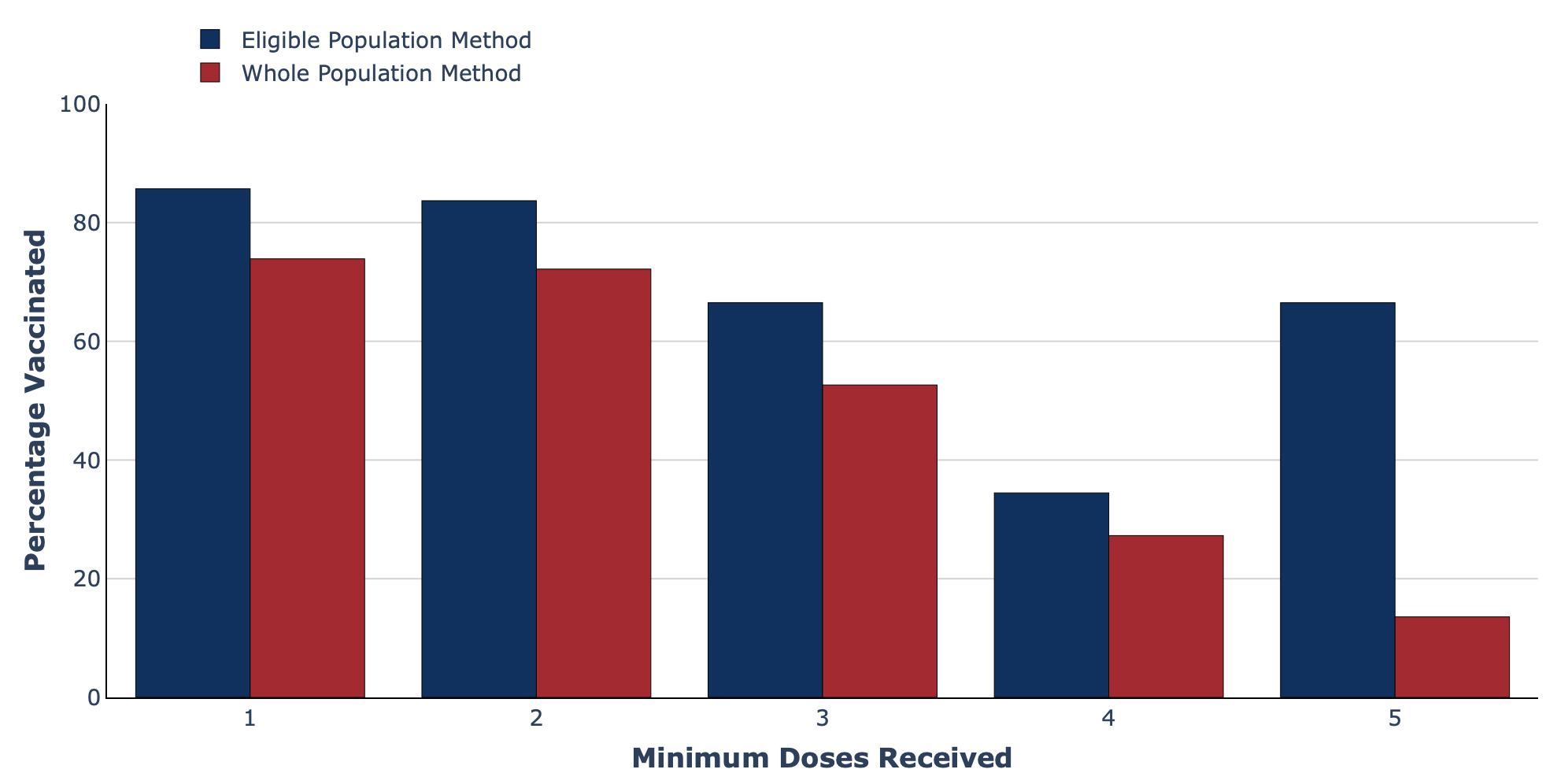
Grouped bar chart from the Swedish Pathogens Portal.
- Stacked bar charts: The CoVEO app (developed by Eötvös Loránd University, Erasmus Medical Center, and Technical University of Denmark) shows how stacked bar plots can be used to illustrate how many samples showed different strains of SARS-CoV-2, whilst enabling readers to easily see the total number of samples tested.
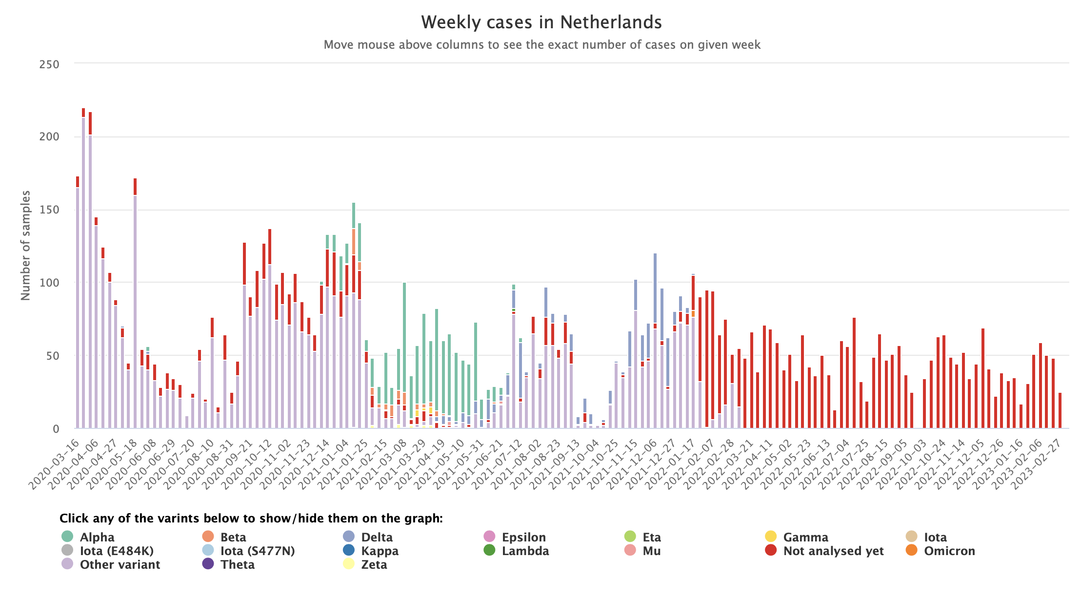
Stacked bar chart from the CoVEO app.
- Scatter plots: MOOD’s COVID-19 scatterplots visualisation tool was used to graphically compare 7-day incidences, and the change in the number of cases, in different regions of Germany.
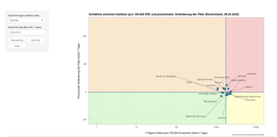
Scatterplot from MOOD
- Heatmaps: The Swedish Pathogens Portal’s vaccines dashboard shows how the amount of vaccine coverage in the population differs according to vaccine dose and patient age.
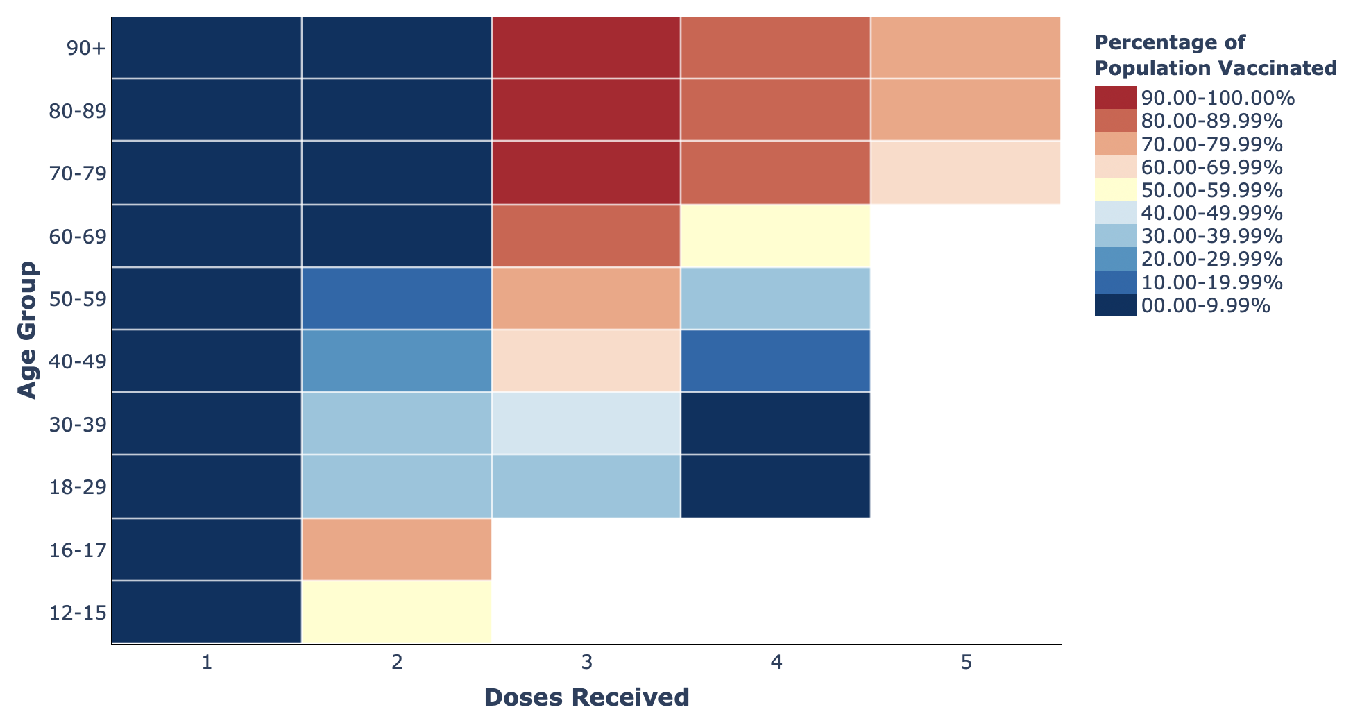
Heatmap of vaccination data from The Swedish Pathogens Portal.
Visualising data distributions
It can often be useful to consider the distribution of the data collected. For example, when determining the likely risk factors for a given disease. There must be at least one numerical component to the data, although some components can be categorical.
Considerations
Multiple types of visualisations are recommended to evaluate the distribution of data. These include histograms, density plots, box plots, violin plots, and population pyramids. All enable you to determine whether the data is skewed, and where the peaks in the data lie.
- Histograms: used when investigating the frequency of occurrences within a single dataset.
- Density plots: provide relatively ‘smoothed’ data distributions compared to histograms. They are useful when there are large amounts of data that cannot be clearly interpreted on a histogram.
- Box plots: most useful when comparing data distributions across multiple groups.
- Violin plots: enable comparisons of the data across multiple groups, but with much more granularity than box plots. They provide a better representation of the raw data, as they show changes over the whole range, rather than the most ‘dense’ part of it. See this animation from Autodesk for a greater understanding of why. Please note that, whilst useful, violin plots may be rarely used in some fields, so some users might find them more difficult to interpret.
- Population pyramids: considered a better option when comparing populations based on categorical data, as it is inappropriate to show these in a ‘smoother’ format, such as a violin plot.
Existing approaches
- Histograms: This histogram of COVID-19 infections in Germany by Joseph Lee McCauley allows users to see the frequency of infections over time. Plots such as this can be used to determine, for example, the type of source behind an outbreak (e.g. whether it is continuous or intermittent), and whether certain events improved/worsened an outbreak.
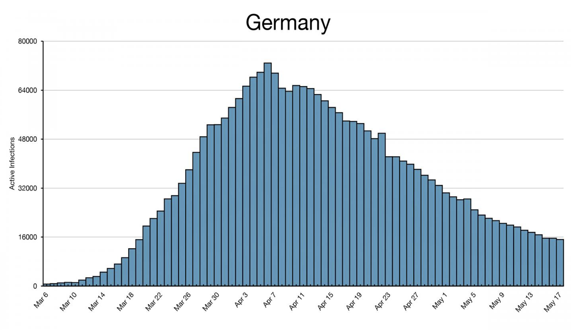
Histogram showing the number of active COVID-19 infections in Germany over time.
- Density plots: Our World in Data have used a density plot to show COVID-19 vaccine doses administered by manufacturer in the European Union
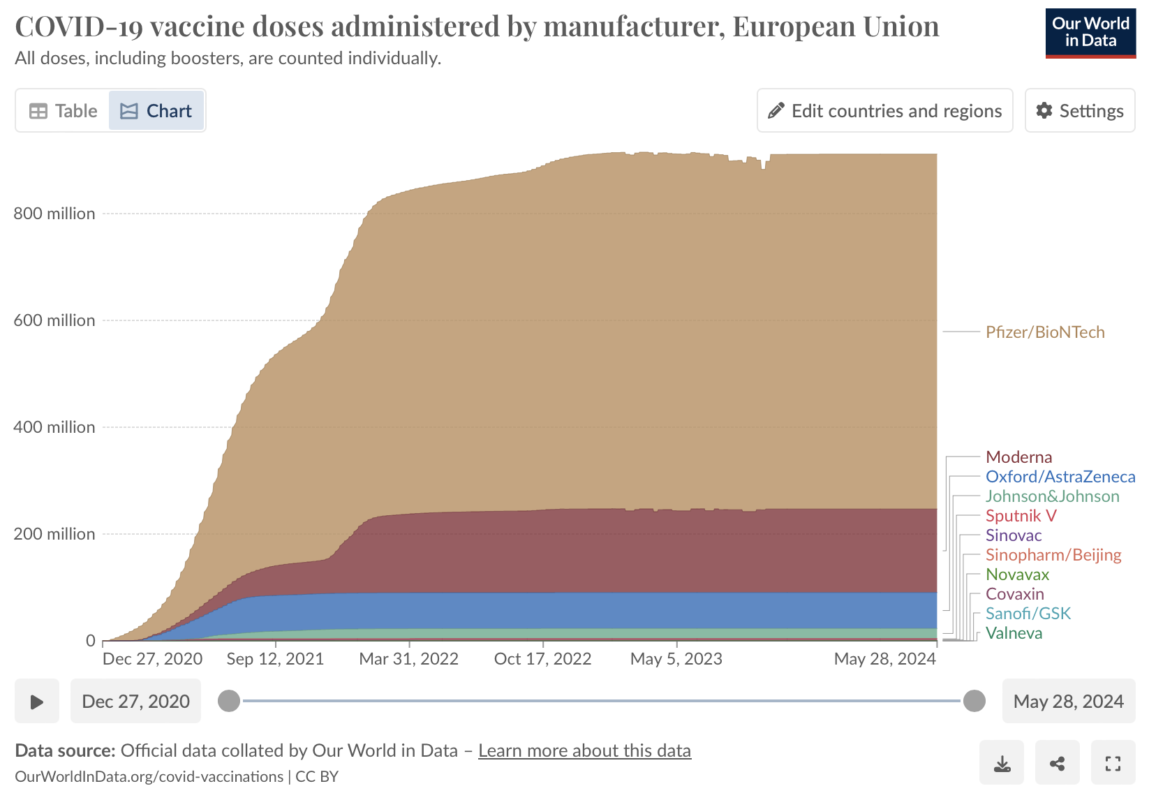
Density plot showing the number COVID-19 vaccine doses administered in the European Union by different manufacturers.
- Box plots: This box plot by the European Centre for Disease Control (ECDC) compares the distribution of MERS-CoV cases in 2016 according to patient age in multiple case categories. This allows users to compare the distribution of age in different case categories.
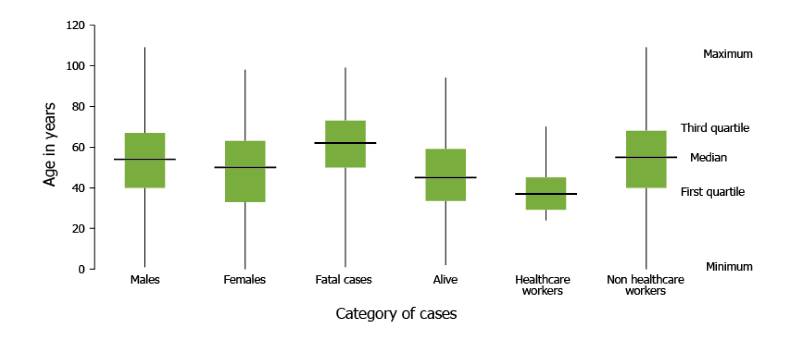
Box plot from ECDC showing the distribution of MERS-CoV cases in 2016.
- Violin plots:The figure 3 from Amirthalingam et al illustrates the S-antibody responses at 14–34 days following the second dose of COVID-19 vaccine.
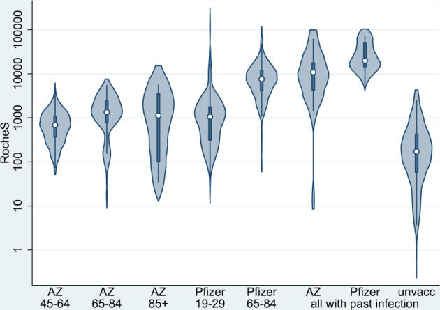
Violin plots showing the S-antibody responses at 14-34 data after a second dose of COVID-19 vaccine.
- Population pyramid: In the University of Tartu’s COVID-19 dashboards population pyramids were used to examine whether males (light blue) or females (pink) were over- or under-tested in different Estonian counties by comparing the number of tests conducted and the population density.
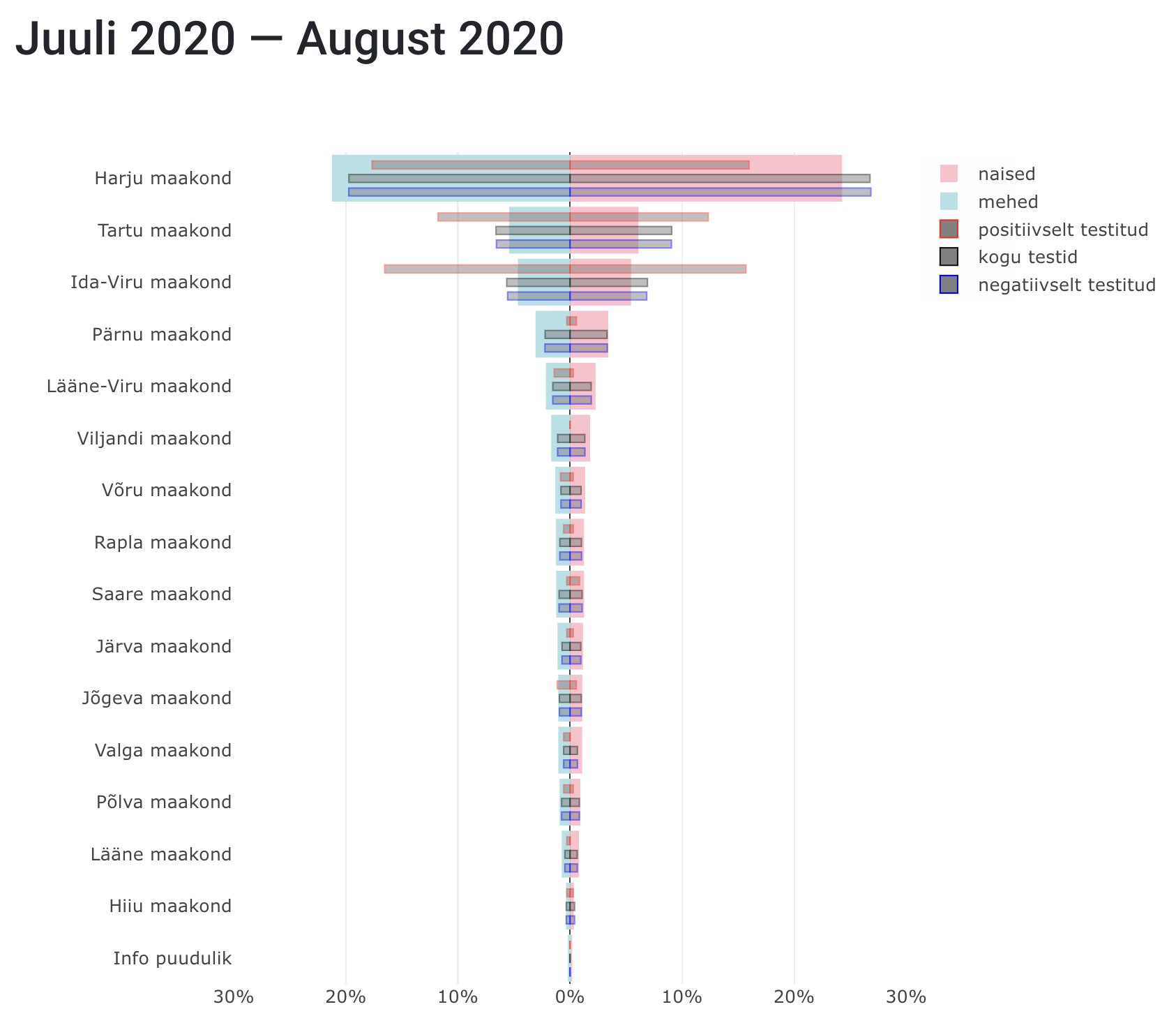
Population pyramid from The University of Tartu examining levels of testing in different Estonian counties.
Visualising data over time
In infectious disease research, data is often collected over time to create a time series. Time series data typically includes a given type of data collected at regular intervals. For example, the number of cases over time, or differences in viral sequence content in wastewater over time.
Time series data allows researchers to identify trends, cycles, and anomalies. This facilitates informed public health decisions and interventions. However, visualising this data effectively requires careful consideration to ensure clarity and accuracy.
Considerations
-
Time series data are often represented in a line plot (with/without dots or other markers present on the line to show the actual data points). Line plots are recommended for visualising time series data as they clearly show the direction of change over time (i.e. the trend of the data).
-
Bar charts may be useful for comparing values at different timepoints, but provide less clear insight into data trends (though they can be overlaid with a line graph).
- Showing many trends together can mean that the plot is overcrowded and thus difficult to read and interpret.
- Consider highlighting significant events and changes (e.g. different waves of an outbreak, or different seasons), and anomalies/potential errors to highlight potential cause and effect in a time series.
- It may be necessary to aggregate data to ensure that the plot does not look too noisy e.g. it may be easier to see overall trends when presenting data in weekly, rather than daily, intervals. In all cases, consistent intervals (e.g. of time) must be selected for use with the graph.
- To enable comparison between different regions and time periods, the scales and intervals must be comparable across the graph to avoid confusion.
Existing approaches
-
In some cases, it can be useful to present multiple comparable time series together. Interactive features can be used to prevent overcrowding whilst presenting many time series together. In static graphs, it is important to limit the number of time series presented in a single graph.
- The Swedish Pathogen Portal’s wastewater dashboard includes line plots showing changes in the levels of viral sequences (for COVID-19, enteric viruses, and influenza) over time in multiple Swedish cities. Users can select which cities to view in the plot; enabling multiple direct comparisons without overcrowding.
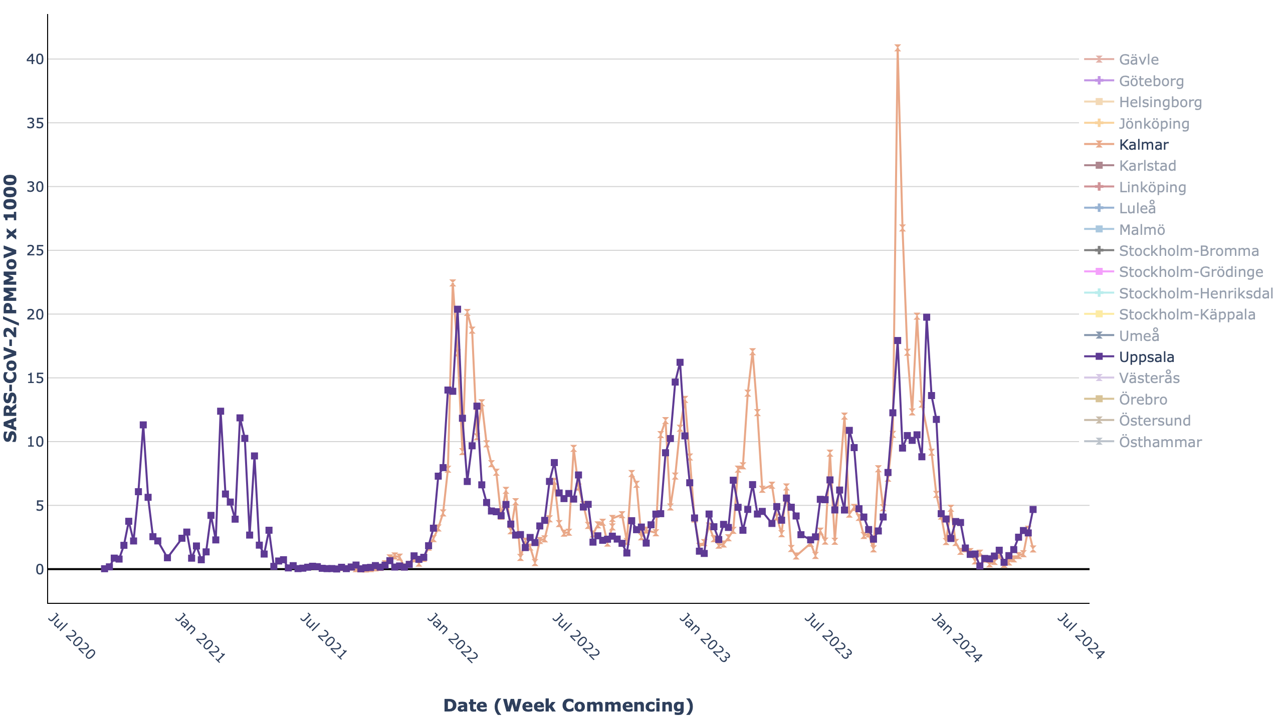
Line plot from the Swedish COVID-19 Portal showing changes in the levels of SARS-CoV-2 virus sequences in wastewater over time.
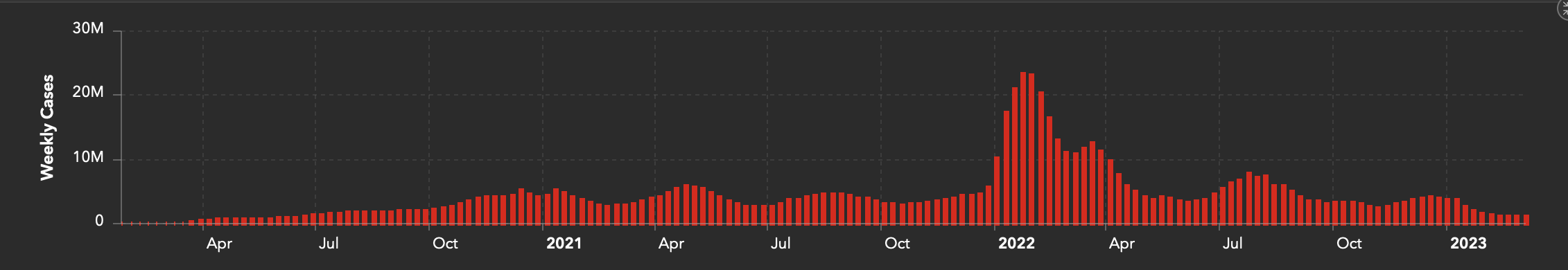
- Interactive features can also enable users to perform more granular analyses by zooming into particular time periods or events. For example, OurWorldInData provides a line plot of time series data on COVID-19 cases, and users can select a given time period or play a time lapse visualisation.
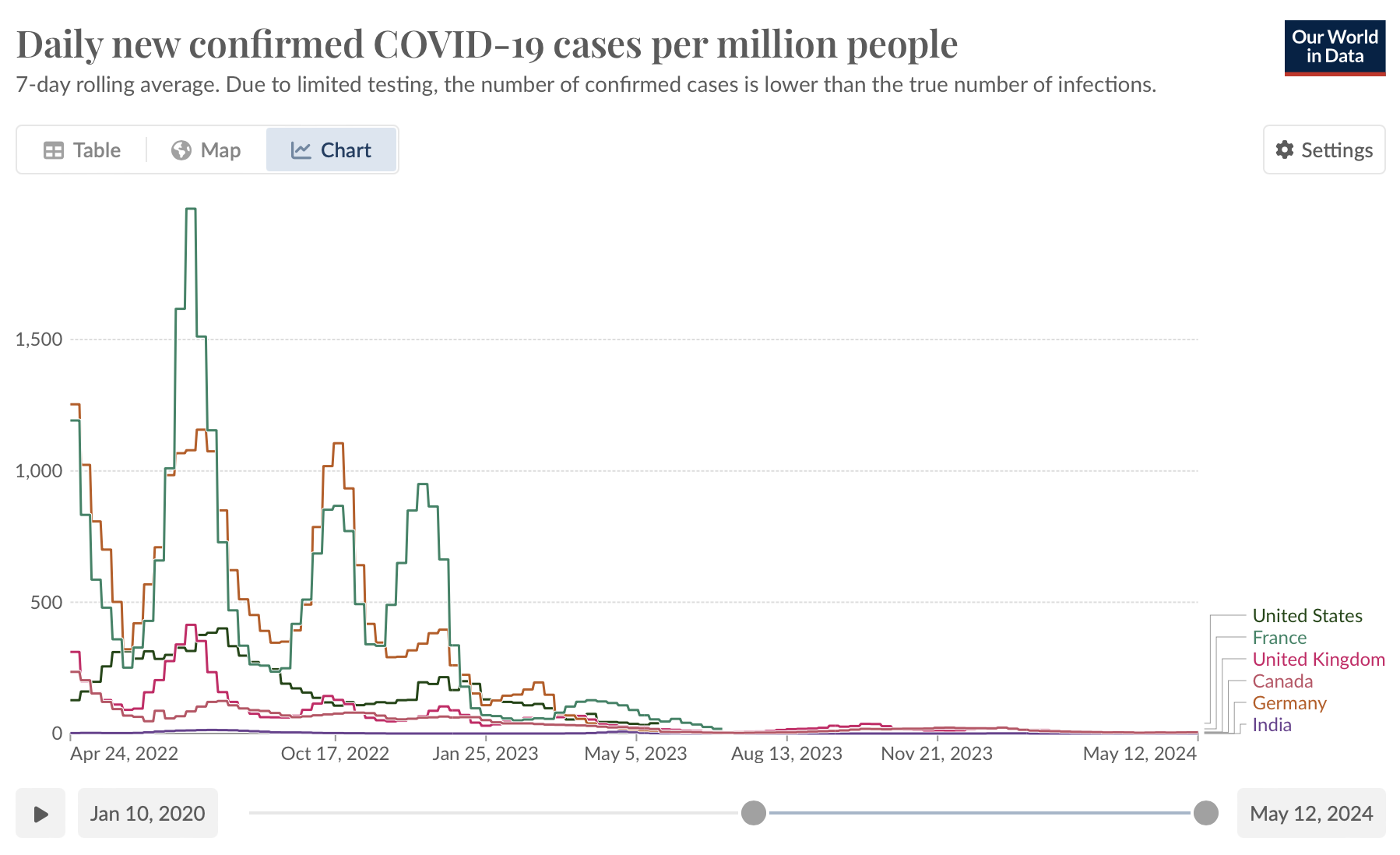
Line plot from OurWorldInData showing changes in the number of COVID-19 cases over time
- Annotations can be used to highlight significant events or changes (e.g. the implementation of a vaccine program), or seasons. Denoting seasonal patterns can be particularly useful for diseases with known seasonal variations, like influenza.
- Potential errors and anomalies can be highlighted with annotations within the graph, or with text around the graph.
- Ridgeline plots (sometimes called joy plots) allow data aggregation by stacking multiple density plots vertically. This helps in visualising the distribution of a dataset across different categories or time periods in a compact and comparative manner. For example, on the figure 4 of Tasakis et al ridgeline plots are used to visualise SARS-CoV-2 viral isolate signature frequencies over time. The figure illustrates dynamic evolution by mutation, drift, selection, and migration, with state-specific plots showing the density of each signature over collection dates, highlighting transitions.
- The scale on the above graphs from both the Swedish Pathogens Portal and OurWorldInData changes dynamically in order to ensure that the trends on the plot are comparable.
Visualising data using maps
Using maps to display geospatial data allows you to show how a virus spreads across different regions. Maps are intuitive and easy to understand for the general public, conveying complex data in a simplified manner. This makes it easier for people to grasp the severity of the situation in their locality, or globally.
Considerations
When creating maps for infectious disease data, consider:
- Scalability: when possible, design maps to handle different levels of detail, from local outbreaks to global pandemics;
- Interactivity: incorporates interactive features that allow users to explore data at different geographic levels and over time;
- Integration of multiple data sources: combine various data layers, such as population density or age groups, to provide a comprehensive view. This can enable the rapid identification of areas at higher risk and in need of more support, which is crucial to mitigate the impacts of an outbreak;
- Contextual Information: Provide contextual explanations and annotations to help users understand the significance of the data presented. Annotations can be used to highlight areas with high infection rates, or regions experiencing rapid increases in case numbers. Annotations can also explain key events, such as the introduction of containment measures or identification of a new variant, helping viewers correlate these events with changes in disease spread patterns;
- Identifying hotspots: maps highlight areas with high infection rates, enabling targeted interventions and resource allocation;
- Temporal analysis: dynamic maps showing changes over time help track the progression of outbreaks and, for example, help evaluate public health measures;
- It is important to select the correct type of map for your data. Two of the most common types of map are choropleth maps and ‘dot’ maps.
- Choropleth maps typically use colouring or sharing to indicate differences between predefined areas (e.g. local municipalities).
- Symbol/dot maps typically include dots of varying size placed in particular areas to represent differences in amount (usually indicated by the size of the dot), and perhaps one other variable (typically shown using the colour of the dot).
- Choropleth maps are recommended over dot maps for showing general, regional patterns in data, and for showing relative data (e.g. the number of cases normalised by population size). Symbol/dot maps are recommended when showing absolute values (e.g. the number of cases) or when showing more than one variable. Neither are recommended for showing subtle differences between regions, where it may be better to use a line plot or bar chart.
- Choropleth maps may give the impression of sharp changes at borders. Similarly, dot/symbol maps can give the impression that the data point relates specifically to the area where the dot is placed, though this is not often the case e.g. when the dot represents the value for an entire country.
Existing approaches
- This choropleth map from the University of Tartu shows the rate of booster vaccination update in the elderly across Estonia, with darker colours indicating higher vaccination rates. The map includes multiple interactive features to allow users to view the data on two different geographic scales (county and municipality) and over time.
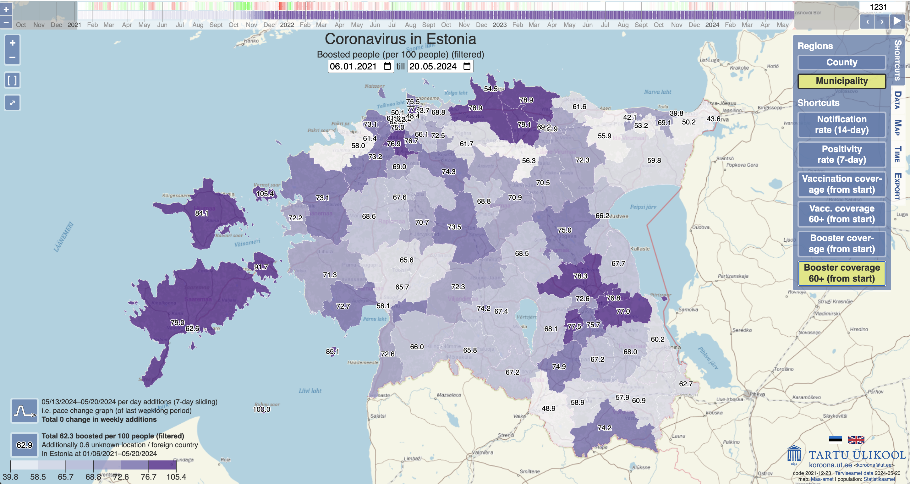
Choropleth map from the University of Tartu showing booster vaccination rates among the elderly in different regions of Estonia.
- The choropleth map from the COVID-19 Event Risk Tool integrates multiple data sources to indicate the risk level of attending an event, given the event size and location that the user can set as a parameter.
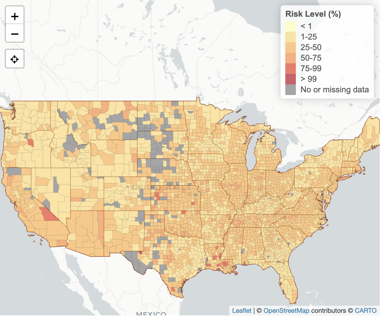
Choropleth map from the COVID-19 Event Risk Tool showing the level of risk associated with attending an event in different areas of the United States.
- Maps can identify and highlight hotspots e.g. areas with high infection rates. On this symbol/dot map from Johns Hopkins University (last updated March 2023), each red circle illustrates the number of cases in a particular time period for a region, with larger circles indicating more cases. The dots may represent whole countries (e.g. Poland) or smaller areas within a country (e.g. Germany), and may be either absolute or normalised by population size.
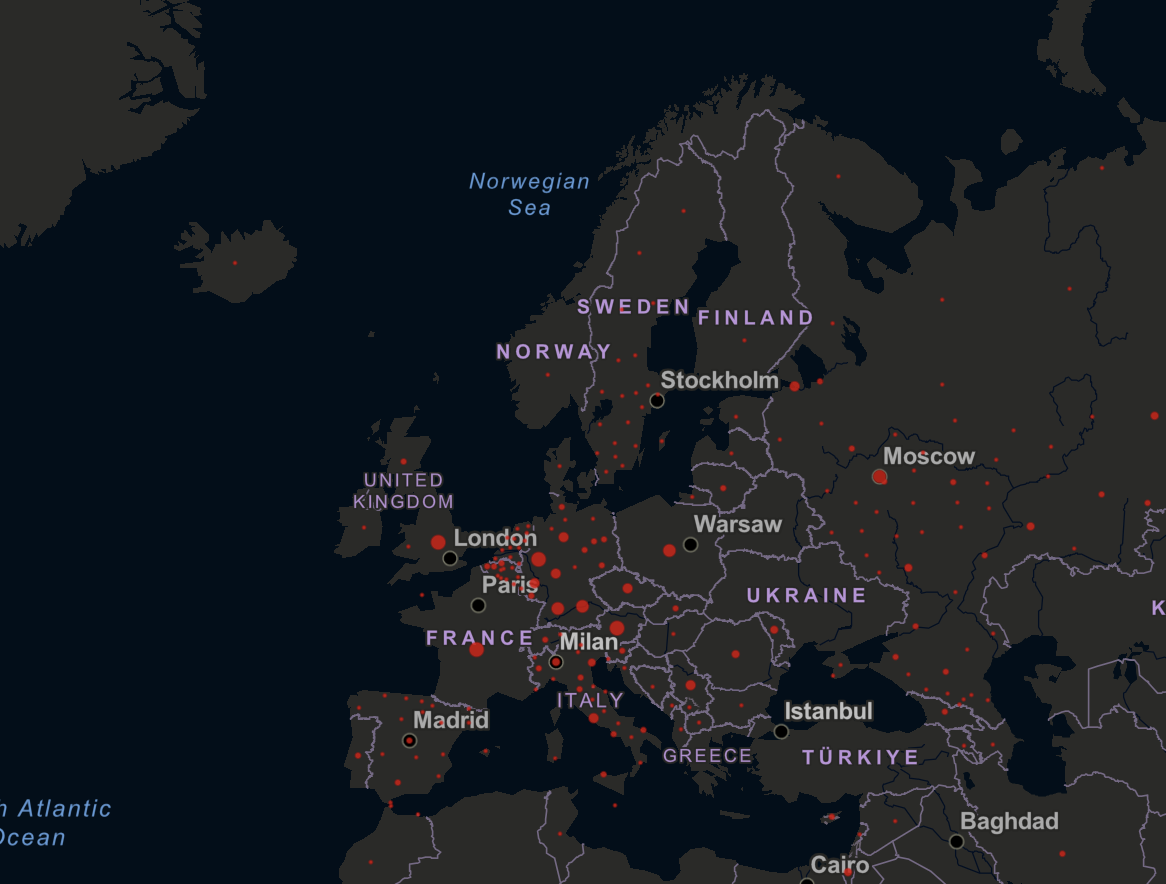
Dot map from Johns Hopkins University.
- Maps can enable temporal analysis of the progression of an outbreak by incorporating interactive features. This can include, for example, how a pathogen spread in a region, or how quickly mitigation measures took effect. This helps to evaluate the effectiveness of public health interventions, and enables strategies to be adjusted accordingly. The map from University of Virginia allows the user to investigate the active cases across the world. Time slider, continent selector and normalisation per capacity allow further customisation of the visualisation.
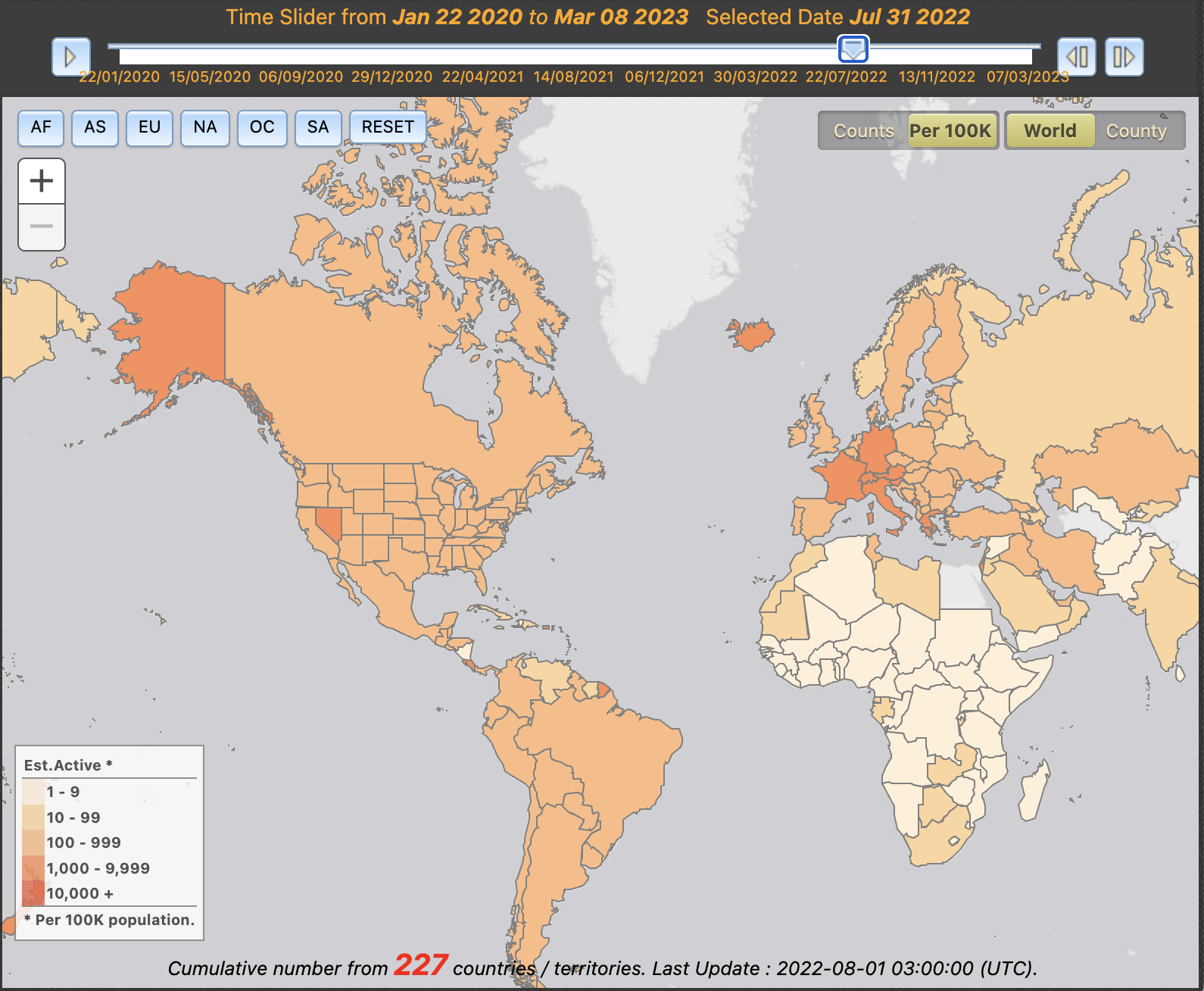
Choropleth map from the University of Virginia showing the number of active COVID-19 cases over time.
Use cases for other types of visualisation
Whilst many different types of plot have been covered in the above sections of this page, many more exist. Some are not generally recommended, whilst others are highly recommended in specific situations.
Considerations
- Pie charts: Often used to show proportion/percentage data that adds up to 1 or 100%, respectively, and to allow comparisons between groups. However, it is considered more difficult to compare between groups in a pie chart than in other types of visualisation, as humans are more able to compare lengths than angles.
- Word clouds: The overinterpretation of word clouds is extremely common, and they are easily manipulated to highlight certain words and phrases. Word clouds should thus be avoided in the vast majority of cases, and interpreted with caution. It is important to, for example, to remember that they do not represent a quantitative assessment of text content. However, there are some use cases where they can be useful e.g. to provide a quick overview of text data.
- Tables: allow users to easily view the data on a row or column basis, to find the data points that are of interest and make one-to-one comparisons. However, other types of visualisation (e.g. scatterplots) are recommended to facilitate broader comparisons.
- Phylogenetic trees: the recommended visualisation type for showing relatedness between species/strains is a phylogenetic tree. However, it is important to avoid overcrowding to ensure that the tree remains readable and easy to interpret.
- Indicator values: it can be useful to provide a quick, easy to interpret daily snapshot of an emerging outbreak. This can include, for example, the number of cases, hospitalisations, vaccine doses, deaths, and recoveries occurring. Indicator values present a single value, potentially alongside an arrow or other representation to show how the value has changed relative to the previous day. They are not useful in showing overall trends, and can be misleading (e.g. where the general trend is declining, but the rate increases on a given day).
Existing approaches
- Instead of using a pie chart to compare between groups of data represented as proportions/percentages, use a stacked bar chart. See the guidance on Investigating amounts above for more guidance. The Swedish Pathogens Portal’s Publications Dashboard uses word clouds to indicate that different funders focus on different topics related to COVID-19.
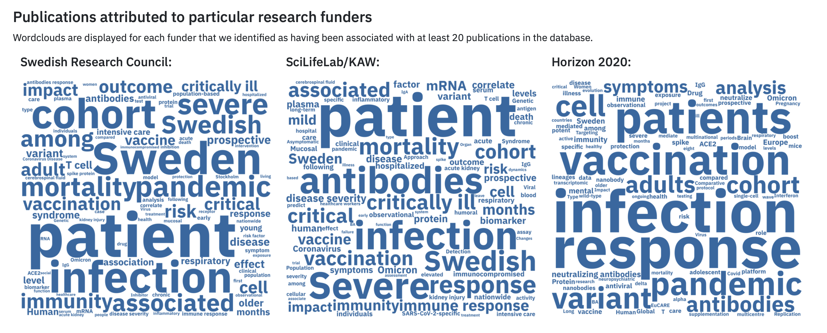
Word clouds from The Swedish Pathogens Portal.
- The European Pathogens Portal uses tables to show e.g. the sequences available for priority pathogens. This allows users to search and access the data quickly, to potentially make broader scale comparisons (e.g. the number of samples available for a given pathogen). However, it is not intended to enable broad comparisons between data categories, for which histograms might be more appropriate.
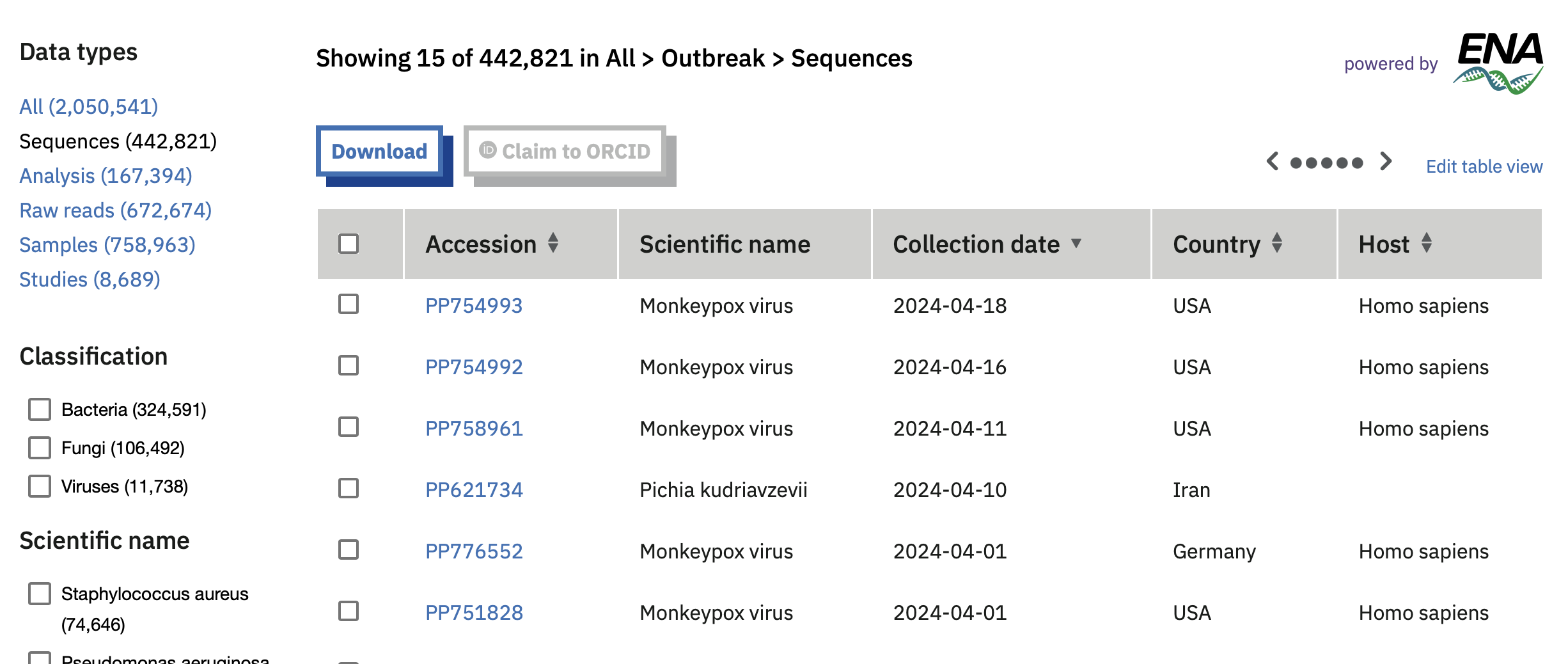
Table showing some sequence data available for priority pathogens on the European COVID-19 Data Portal.
- GISAID represents the phylogenies of different pathogens (e.g. the influenza H1N1 strain) in phylogenetic trees. Interactive features including filtering, zooming, and multiple layout views are used to prevent overcrowding, and ensure that the trees are easy to view and interpret.
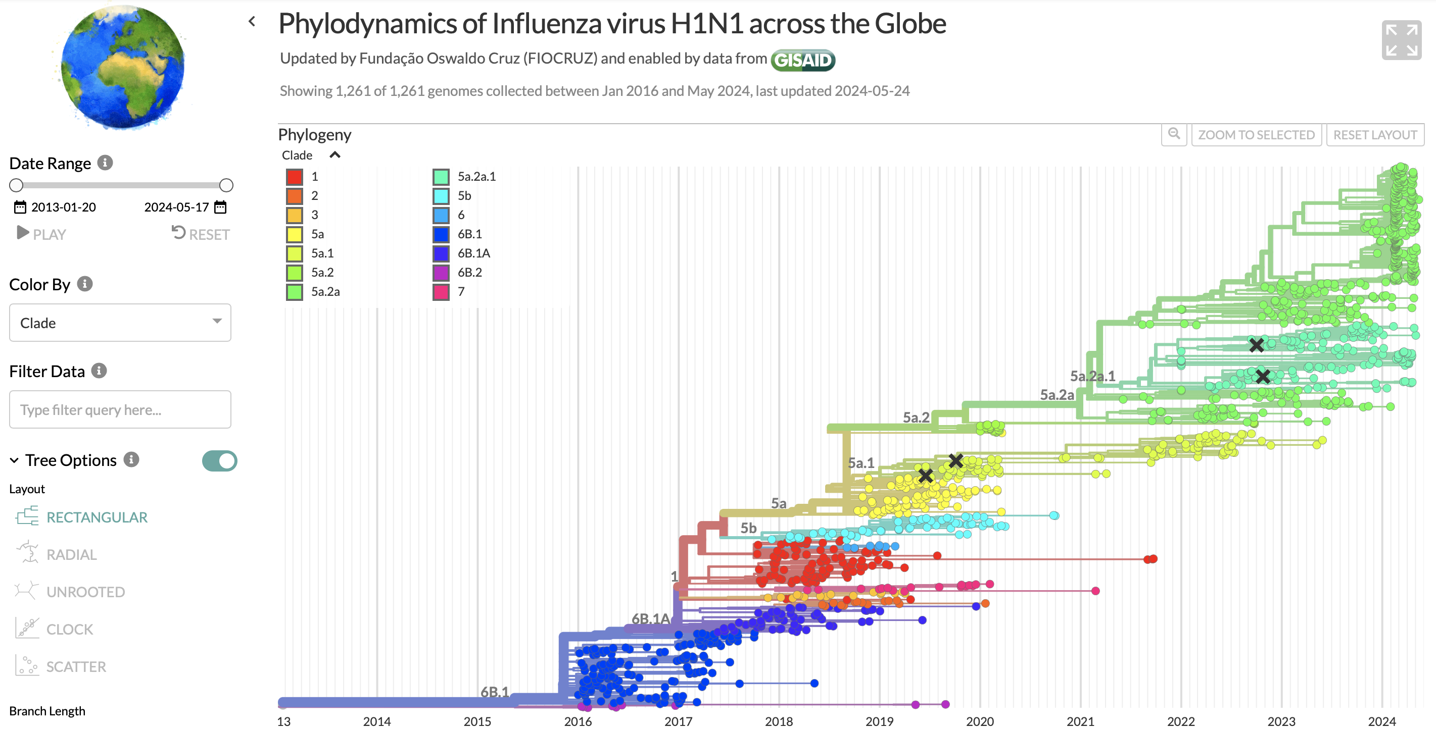
Phylogenetic tree showing H1N1 sequences in GISAID.
- The COVID-19 Dashboard from Johns Hopkins University uses indicators to show the numbers of deaths, hospitalisations, and vaccine doses.
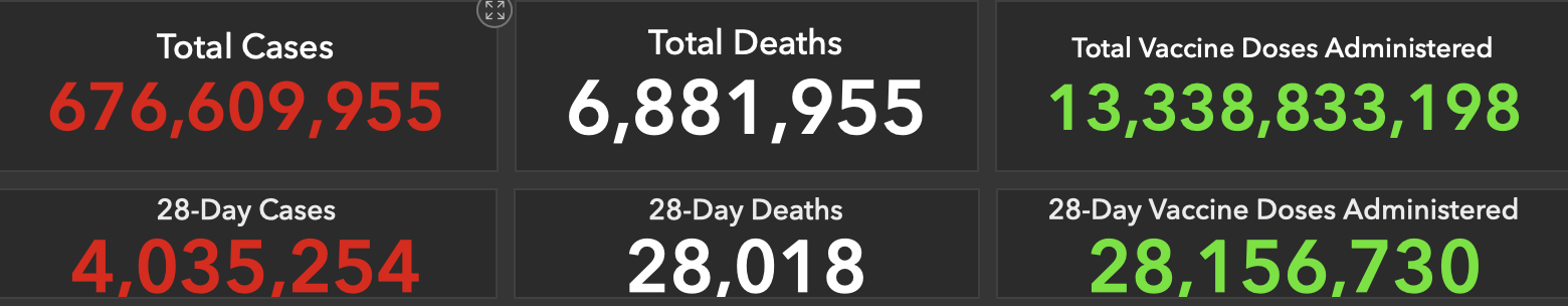
Indicator values showing deaths, hospitalisations, and vaccine doses for COVID-19 worldwide.
Dashboards
While a single plot can provide a good overview of the data at hand, combining different plot types together would give a more comprehensive picture of the situation. Dashboards often combine line plots, maps, heatmaps and bar plots to visualise data about the same topic.
Considerations
When developing dashboards, it is worth keeping in mind the following:
- Consistent colouring is crucial for avoiding confusion and enhancing readability, as it ensures that the same colour scheme is used for specific data types, like infection or recovery rates;
- Avoid overcrowding by prioritising key metrics, and presenting data clearly and concisely. This will ensure that the dashboard remains user-friendly;
- Complementary plot types, such as line charts, bar charts, and heat maps, can be used in combination to provide a comprehensive view of the data without redundancy, making it easier to understand different aspects of the data;
- Easy-to-use controls are essential for allowing users to filter and interact with the data, making the dashboard more functional and adaptable to user needs;
- Clear and informative legends and labels help users to quickly understand the visualisations, enhancing their ability to interpret the data accurately;
- Real-time data updates ensure that the dashboard provides the most current information, which is crucial for managing infectious disease outbreaks effectively. It is important that users are able to see when the last update was made;
- Responsive design is important for accessibility across different devices, ensuring users can access and interact with the data on desktops, tablets, and smartphones;
- Providing contextual information and explanations for the presented data helps users understand the significance of the metrics and trends, making the data more meaningful and actionable;
- Use a logical layout to guide users through the data efficiently, improving the overall user experience and ensuring that the dashboard serves as a powerful tool for monitoring and managing infectious disease outbreaks.
Existing approaches
- The ECDC Surveillance Atlas of Infectious Disease comprises a dashboard depicting data from Europe on different pathogens. The map shows cases in different European countries, the line plot shows reported cases over the last fifteen years (before 2022), and a bar plot shows the distribution of patient age.
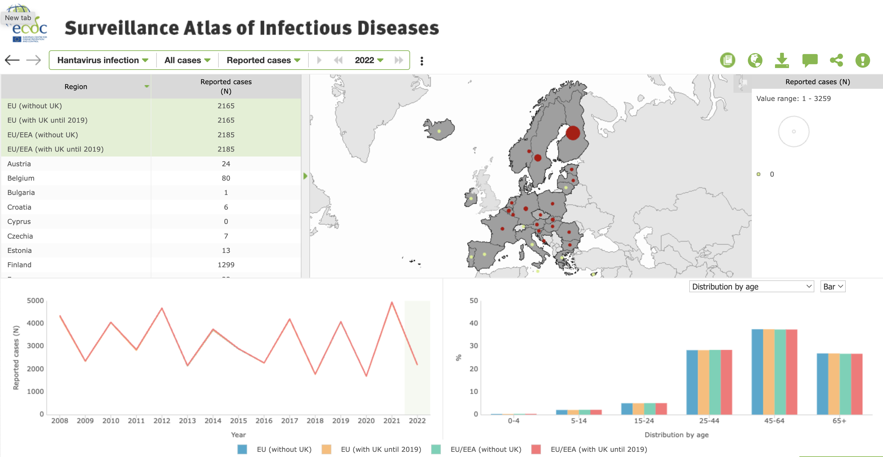
Dashboard from ECDC’s Surveillance Atlas for Infectious Disease
- The University of Tartu COVID-19 dashboard displays positively tested cases, hospitalisations and death information during a nine-month period. The data is further split by age groups.
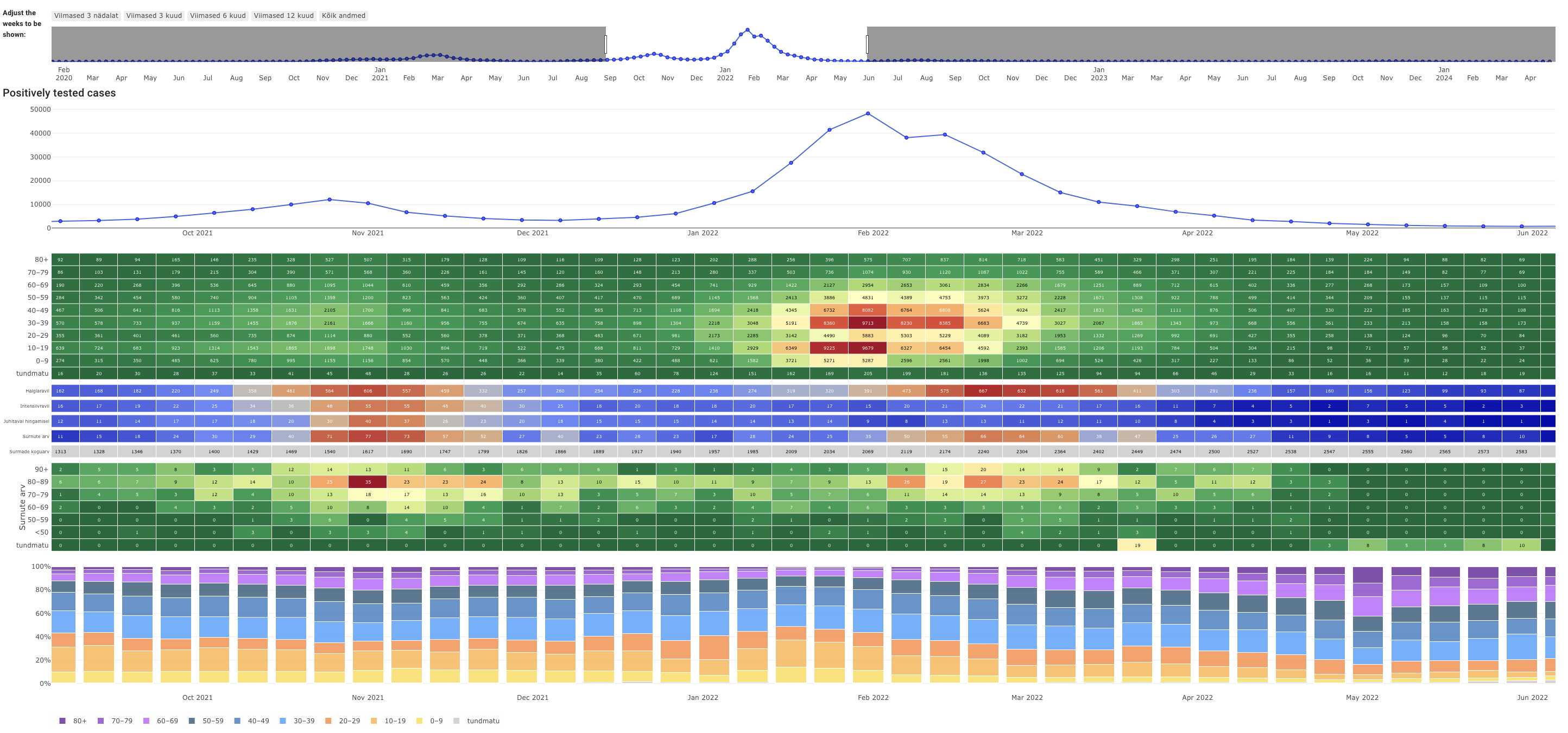
COVID-19 Dashboard from The University of Tartu
- The Swedish Pathogen Portal Dashboard on the register-based COVID-19 vaccination study (RECOVAC) shows data on the the number of cases and vaccination doses in people with different comorbidities over time.
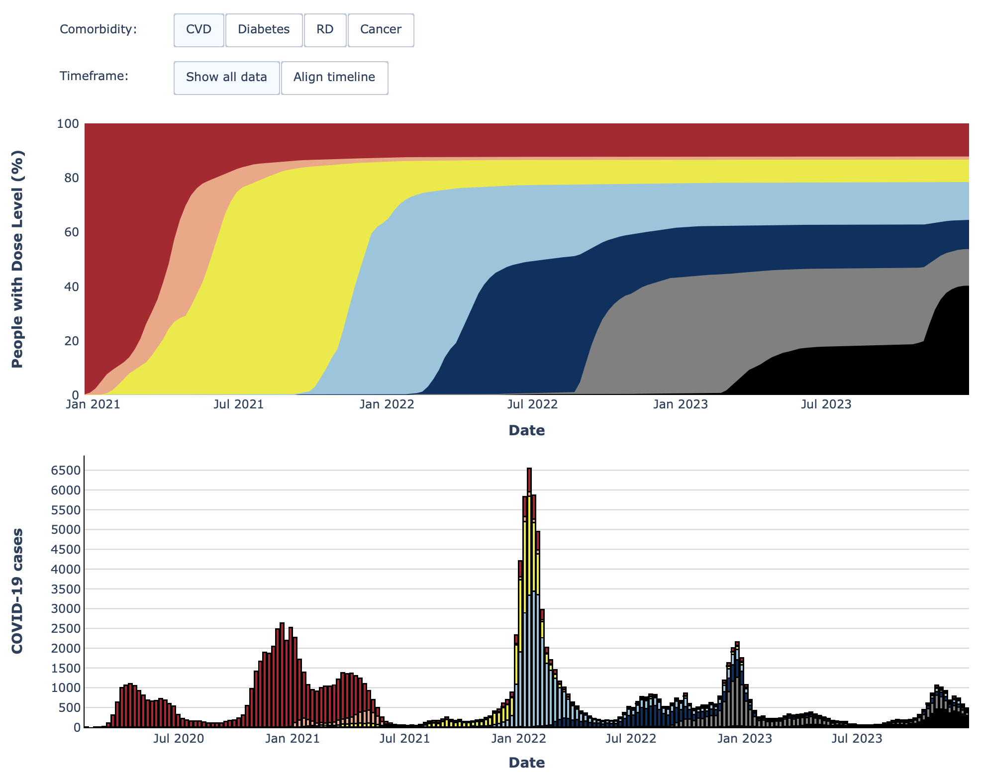
Area under the curve and stacked bar chart from the Swedish Pathogens Portal’s register-based COVID-19 vaccination study (RECOVAC) dashboard.
Useful software libraries
Flexible plotting libraries such as Vega via Altair provide powerful tools for visualising complex epidemiological data. Altair, a declarative statistical visualisation library for Python, utilises Vega, a visualisation grammar, to create highly interactive and informative charts and graphs. This capability is especially important in infectious disease management, where understanding the spread, identifying patterns, and making data-driven decisions is essential.
Considerations
When selecting software libraries for plotting infectious disease data, researchers should ensure the tools they choose are capable of producing accurate, clear, and informative visualisations. Below are some key considerations and recommendations for software libraries.
- User-friendly: the library should be easy to use, even for those who may not have extensive programming experience. It should offer straightforward functions for common plotting tasks.
- Comprehensive documentation: good documentation and tutorials can significantly reduce the learning curve and help users make the most of the library’s features.
- Range of plot types: the library should support a wide range of plot types, including line charts, bar charts, histograms, scatter plots, and more advanced visualisations like heatmaps and geographical maps.
- Customisation options: the ability to customise plots (e.g., colours, labels, axes, legends) is essential for creating clear and informative visualisations.
- Handling large datasets: the library should be capable of handling large datasets efficiently, without significant performance degradation.
- Interactivity: for more in-depth analysis, the library should support interactive features, such as zooming, panning, tooltips, and clickable elements.
- Data integration: the library should easily integrate with common data formats and sources (e.g., CSV, JSON, databases) and work well with other data processing libraries.
- Cross-platform compatibility: The library should be compatible with multiple operating systems and work seamlessly across different platforms.
- Active community: an active user community can be a valuable resource for troubleshooting issues, sharing tips, and finding inspiration.
- Regular updates: libraries that are regularly updated are more likely to have fewer bugs and offer new features and improvements.
In addition to technical capabilities, it’s important to consider libraries and tools that empower data producers (such as epidemiologists, public health officials, and researchers) to create and modify visualisations independently, without needing extensive help from software developers. These tools should prioritise user-friendliness and accessibility. For example, low-code or no-code environments enable users to create complex visualisations through minimal programming, often using a visual interface.
Existing approaches
- Vega is a declarative language designed for creating, sharing, and exploring interactive visualisation designs. It uses a JSON syntax, making the specifications both human-readable and machine-readable.
- Altair is a Python library built on top of Vega, offering a high-level interface for creating a wide range of visualisations with a few lines of code. It offers exploratory data analysis: interactive charts allow users to explore their data dynamically. Features such as tooltips, zooming, and filtering enable deeper insights into the data. Once the columns of data that are available for plotting are defined, different plot types such as circles, bars, grids can be drawn by the user. All column combinations are theoretically possible to visualise.
The two plots below depict the exact same data on SARS-CoV-2 clades across various Estonian counties. One uses circles to represent the number of samples per clade and county, while the other employs heatmaps to visualise values.
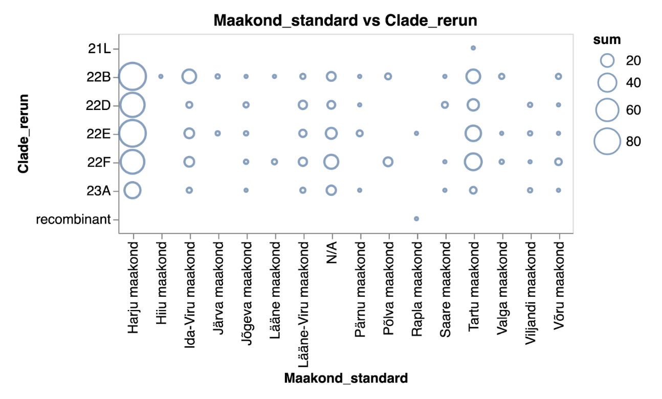
The number of samples indicating different SARS-CoV-2 clades across Estonian counties represented as a scatter plot in blue tones.
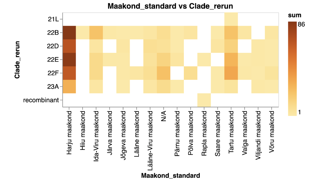
The number of samples indicating different SARS-CoV-2 clades across Estonian counties represented as a heatmap in yellow to orange tones.
More information
Links to RDMkit
RDMkit is the Research Data Management toolkit for Life Sciences describing best practices and guidelines to help you make your data FAIR (Findable, Accessible, Interoperable and Reusable)
Training
Contributors
University of Tartu / ELIXIR-Estonia
 Editor
UTARTU / ELIXIR-EE
 Editor
SciLifeLab / Uppsala University